Overview
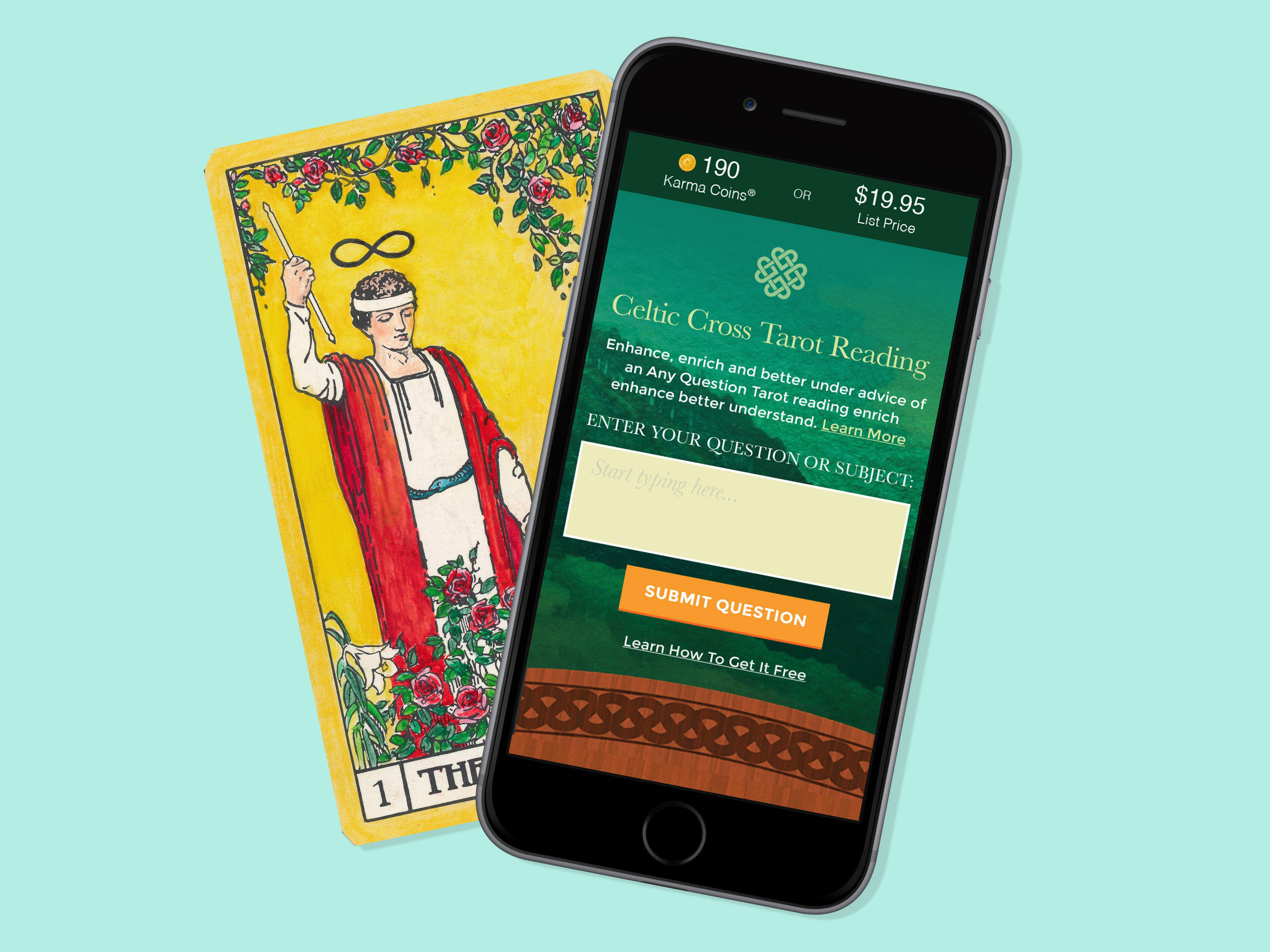
Online astrology reports are usually long blocks of text decorated with outdated clip art. Tarot.com sought to change this and turn their reports into interactive works of art. As Creative Director and Senior Product Designer, I was tasked with innovating a traditional product in a way that would appeal to a broader demographic without alienating our existing users.
THE TEAM
1 General Manager
1 Creative Director
1 Visual Designer
1 Illustrator
4 Engineers
THE PROBLEM
There are a lot of free astrology reports out there. Why would anyone pay for one from us? Tarot.com believed their content to be higher in quality, but that's not always enough for the consumer. These reports had to be memorable–something the purchaser would want to keep, print out, and even gift to another. The reports also needed to be beautiful, immersive, and interactive across all platforms. How would this be accomplished without overwhelming users?
DISCOVERY & EXPLORATION
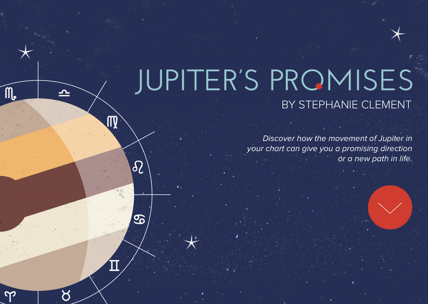
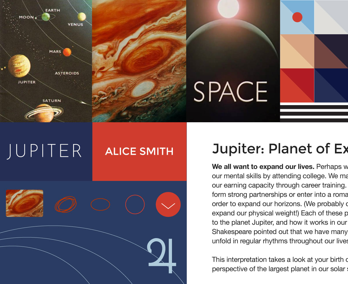
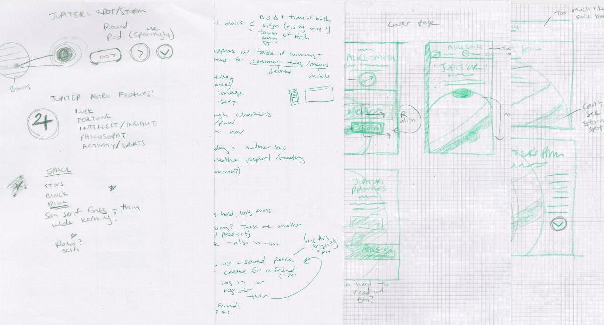
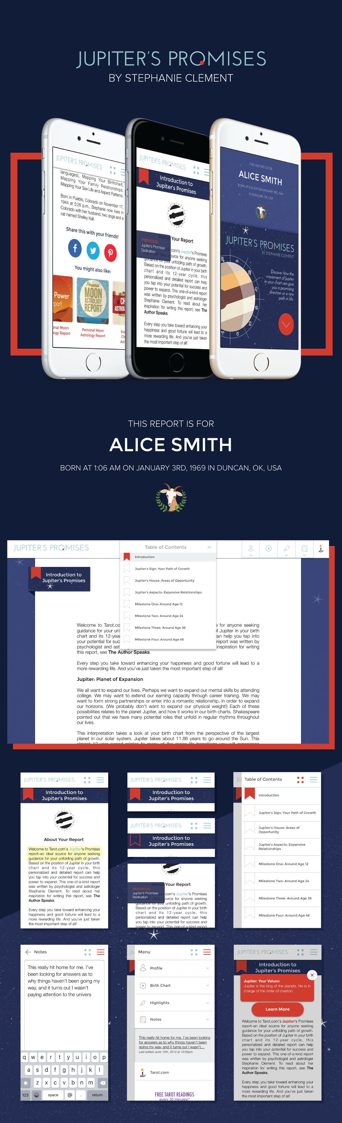
First I sat down with the GM of the the company to learn more about the history of our products, more about astrology in general and our users. I learned why certain details of a report are meaningful, why specific terms matter, and what astrology followers value most. I then looked into the user personas among Tarot.com customers, their browsing habits, and their typical purchases. One of the great things about our users was their devotion to our products. They were highly vocal about their likes, dislikes, and wishes. This helped pinpoint pain spots and potential value-adds. From here, I explored all the themes and imagery of this particular report. One strong visual was the red spot–the storm–on Jupiter.
DESIGNING THE PRODUCT
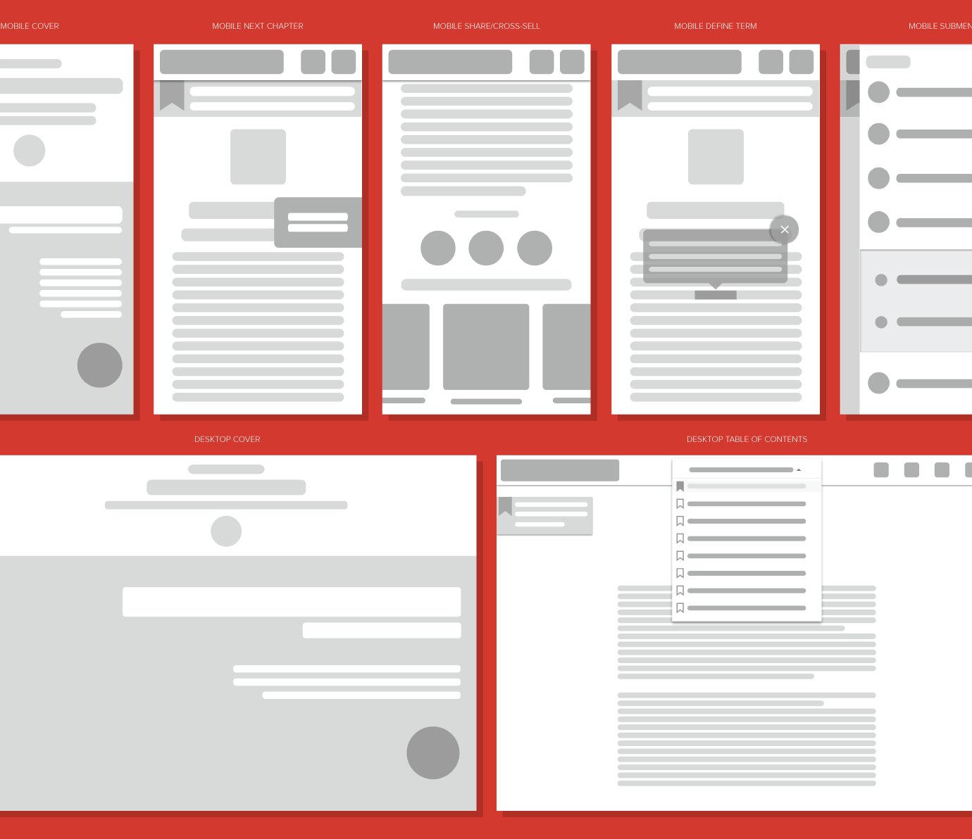
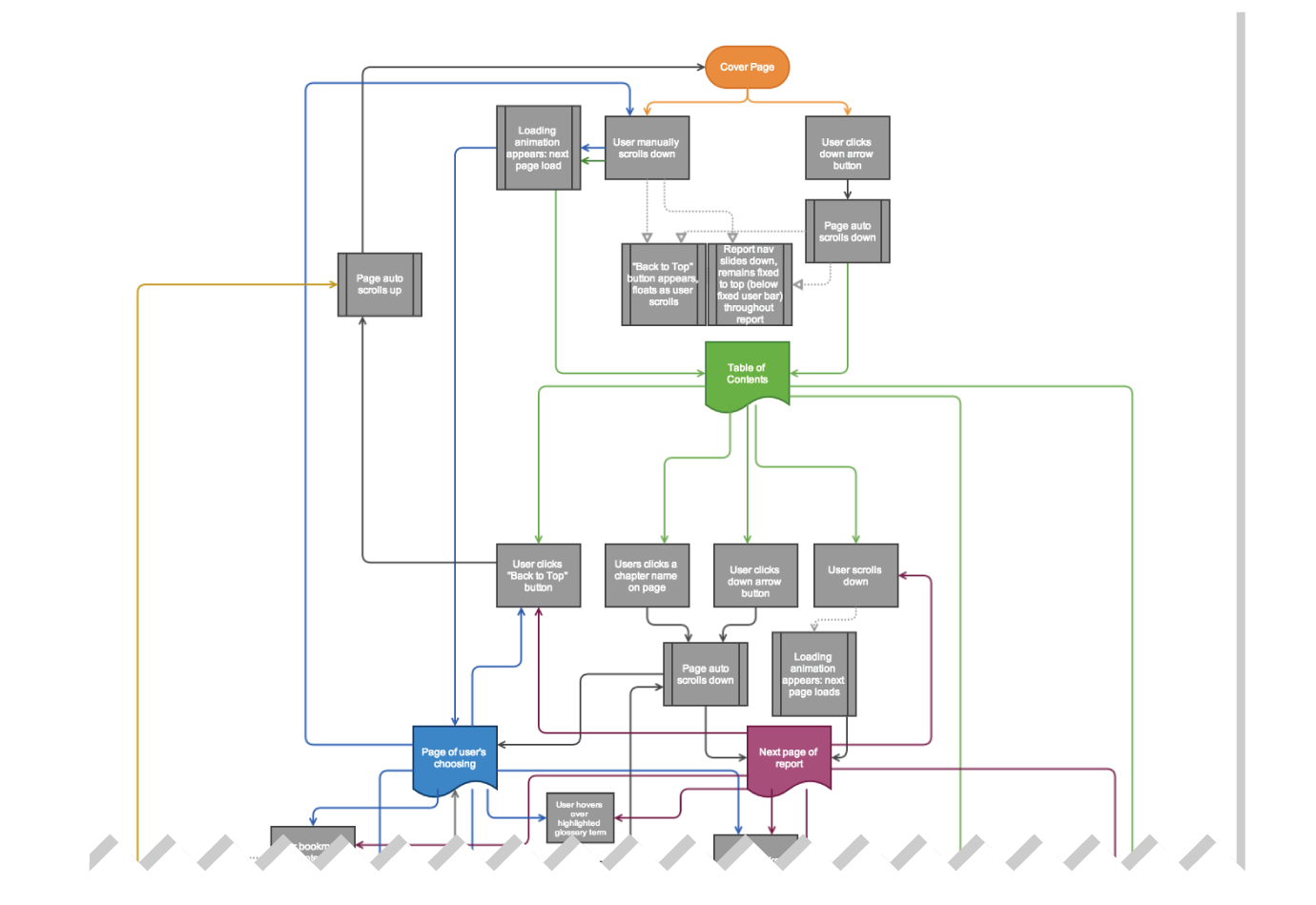
With information in hand, I sketched ideas and composed a list of features. Then my team and I met with stakeholders and engineers to iron out our early thoughts and determine what engineering resources would be required and available to us before the deadline. After a few iterations, I produced wireframes, created a UX workflow, and worked with our illustrator and visual designer on UI elements before creating mockups.
THE SOLUTION
CONCLUSION
Jupiter's Promises went through several identity changes–from a mobile and desktop app to a responsive website–and several development and design phases. The product remains in production, but a limited version of it is live for purchase at Tarot.com and has received positive response from customers old and new.